In today’s digital world, design psychology plays a critical role in how users interact with websites, apps, and visuals. It’s no longer enough for a design to look good — it needs to feel right. The colors, spacing, layout, and flow of a digital interface all work together to guide perception and influence decisions.
Our brains are wired to respond to certain visual patterns, shapes, and arrangements — often without us even realizing it. What we click, where we scroll, what we trust, and how quickly we act are all deeply shaped by subtle psychological cues embedded in design.
This is where design psychology becomes a powerful tool. By aligning design choices with how the human mind naturally processes information, we can create experiences that are not only aesthetically pleasing but also intuitive, persuasive, and effective.
In this article, we’ll explore the science behind design psychology and how it shapes the way we see and decide — including why some layout choices like horizontal design may not be as effective as they seem, despite their popularity among big-name platforms.
What Is Design Psychology?
Design psychology explores how visual design influences the way people feel, think, and act. It’s the intersection of aesthetics and human behavior — a blend of neuroscience, cognitive psychology, and perception theory that helps designers create experiences that don’t just look good, but feel right to the user.
It draws on how our brains process visual information: how we scan a page, where our attention goes first, what colors evoke trust, and what layouts reduce friction. These design choices aren’t just artistic decisions — they’re backed by decades of research into how the human mind interprets and reacts to visual stimuli.
From content hierarchy to spacing, from symmetry to contrast, every element plays a role in shaping the emotional and functional impact of a digital experience. Whether it’s encouraging a purchase, building trust, or simplifying navigation, design psychology provides the framework to make those outcomes more likely.
This becomes even more important when users are mentally drained or overwhelmed — a state often described as decision fatigue, which makes it harder for them to process complex layouts or make confident choices.
The fascinating part? Much of what we “like” or “trust” in a design isn’t a conscious decision at all. It’s biological — hard-wired into our neural architecture through evolution and learned behavior. That’s what makes design psychology such a powerful — and often underestimated — tool in the digital world.
Why Horizontal Layouts May Be Overrated — Insights from Neuroscience
One might assume that wide, horizontal layouts are more user-friendly — especially since platforms like Airbnb and Booking use them. But according to design psychology and eye-tracking studies, the opposite may be true.
A/B testing on a travel booking site with over 75,000 users showed surprising results: a vertical reservation module outperformed a horizontal one by 38% in conversions.
📈 That’s a massive uplift for a small UX tweak — a clear example of design psychology in action.
Researchers found that users scroll 34% more on vertically structured content. Our eyes are biologically wired for vertical scanning — not horizontal. The extra effort needed to scan sideways creates friction, even if it’s subtle.
Gestalt Principles and Illusions — Why It Works
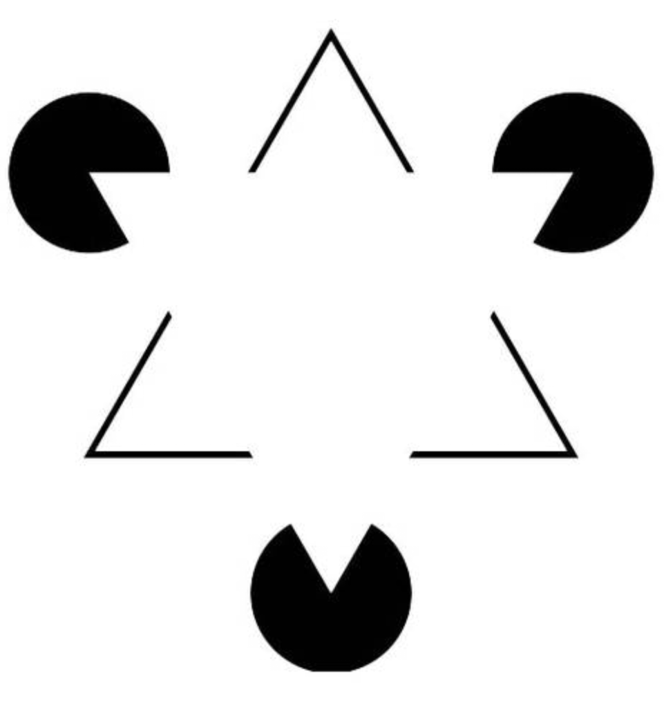
The effectiveness of vertical layouts can also be explained by Gestalt principles, particularly object recognition and closure. In simple terms, our brains prefer structured continuity and find it easier to “complete” and process vertically stacked content. Horizontal divisions, on the other hand, often feel disjointed or fragmented — slowing down the user’s decision-making process.
The famous “triangle illusion” visuals demonstrate how our minds fill in missing shapes and patterns. This very instinct is what helps us digest vertically aligned layouts faster and with less cognitive strain.


Real Data Doesn’t Lie
Let’s look at the raw numbers from the A/B test:
| Test | Visitors | Conversions | Conversion Rate | Change | Significance |
| A (Horizontal) | 38,121 | 87 | 0.23% | – | – |
| B (Vertical) | 37,770 | 119 | 0.32% | +38% | 98% |
The results confirm what neuroscience already suggests: designing with psychological insight drives real-world impact.
Practical Applications of Design Psychology
- In UX/UI design, design psychology helps reduce cognitive load.
- In e-commerce, smart visual design increases trust and purchase intent.
- In marketing, emotionally resonant layouts increase retention and click-through rates.
Designers who understand these principles can craft better user journeys — not just visually appealing, but psychologically optimized.
Why Design Psychology Is the Future of UX
In a competitive digital world, understanding and applying design psychology is not a luxury — it’s a necessity. Whether you’re designing a landing page, an app, or an entire platform, the way visuals interact with the human brain can determine the success or failure of your design. Horizontal layouts, emotional triggers, and intuitive flow aren’t just design choices — they’re psychological tools.
Add Depth with Research and Resources
If you’re interested in learning more about the science behind these techniques, consider checking out Nielsen Norman Group’s work on user experience psychology. They provide extensive insights into human-centered design, backed by research.


